BusClo
UX/UI Design - Google Professional Certificate - 2022
Role
UX + UI Design, Research, Wireframing, Prototyping
The Problem and Target Audience
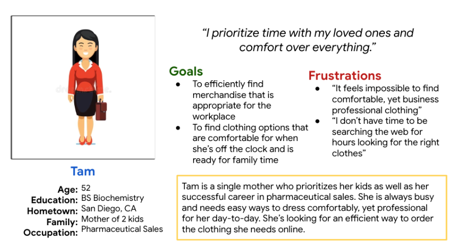
Many people lack the time to shop for clothing due to their busy work schedules and personal lives. It can be difficult to find a specific type of clothing, especially for business-appropriate workwear, in one place. In addition, numerous retail apps are not intuitive and difficult to navigate for users. Our target audience is working adults who identify as female.
Goals and Solution
Project Overview
We wanted to design a solution that enabled users to easily find clothing options. One way to do this is through clothing collections that are curated by stylists. In addition, clothing types were filtered into specific categories for quicker navigation.
Research Details
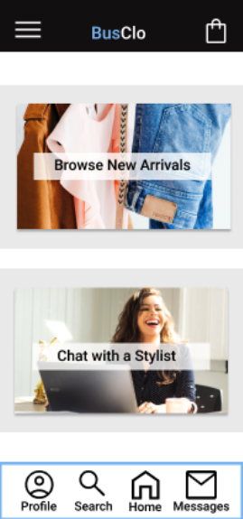
At first, user problems were identified and personas were created. Then a competitive audit was conducted between companies with similar merchandise, like the clothing brand J.Crew. Multiple storyboard were also built in order to better understand the user’s experience with our product. I conducted a few unmoderated usability studies with the low-fidelity prototype, in which I observed and analyzed participants’ click path and noted any significant thoughts that they had in order to inform my future designs. At first, I assumed that users would want to speak directly with a stylist, but after research and designing, I realized that this was still not an efficient way to shop. So, I then deleted the stylist chat room option and created a potential page of curated clothing items that would come from stylists’ suggestions.
-
User Pain Point #1
Clickpath
The clickpath is for adding items to a shopping cart/bag is difficult, so there needs to be options to continue shopping or proceeding through the checkout process
-
User Pain Point #2
Navigation
The navigation for some apps and websites are not intuitive, so designs need to have intuitive icons
-
User Paint Point #3
Too Many Options
Based on the competitive audit and observations from usability studies, users feel like there are often times too many options to choose from when shopping.
-
User Pain Point #4
Time
Users do not have a ton of time to go through merchandise, add it to their carts/bags, and complete the checkout process. So this entire process needs to be efficient and straightforward.
Paper Wireframes
I made sure to sketch out all potential design layouts for multiple pages. These sketches are different variations of the home screen. I also completed brainstorming exercises such as Crazy-Eights, to come up with potential app features and designs.
Digital Low-Fidelity Wireframes
The goal of the lo-fi mockups and prototype was to test if the user journey and basic navigation was intuitive and useful for users.
Low-Fidelity Prototype
Usability Study Findings
Unmoderated usability studies were conducted with 5 participants, each being assigned the same 4 tasks to complete while using the low-fidelity prototype. The tasks had to do with adding an item to their cart, navigating to the profile page, and completing the checkout process.
Round 1
Icons not accessible
Lacking interactivity
Too many options
Round 2
Stylist chat room not useful
Users want to easily add to the cart
High-Fidelity Mockups
Before Usability Study
After Usability Study
What I Learned & Next Steps
What I Learned
The importance of research and being openminded to multiple iterations, including complete redesigns. In addition, as this was my first project, I really learned the importance of user-centered design. Just because I have an idea that I think could be beneficial, I have to be ready to take my designs in other directions if that is what benefits the user most.
Next Steps
More screen options to add to the user journey
Recruit more participants for another usability study to see if there are more ideas that would benefit the user and the user journey


