Blossoms & Buds
UX/UI Design - Google Professional Certificate - 2023
Role
UX + UI Design, Research, Wireframing, Prototyping
The Problem and Target Audience
There are websites for floral shops with overwhelming designs, uncategorized sections, and confusing navigation for the ordering and checkout process. The typical user is between 18-65 years old, and buys floral pre-made floral arrangements at least once a year.
Goals and Solution
Project Overview
Design Blossoms & Buds website to be organized and the delivery/pickup ordering process to be streamlined. Include a feature that allows users to select the date and time for either a floral delivery or pick-up in advance. The website is responsive, to work on both desktop and mobile devices.
Research Details
User problems and personas were identified and created. Competitive audits were conducted to analyze the features or lack there of for other flower shops. Interviews were also conducted to better understand what some user goals are. From there I discovered that users would prefer to have an easy way to schedule flower deliveries or place recurring orders. Target users also want an organized website because they tend to get overwhelmed by too many options.
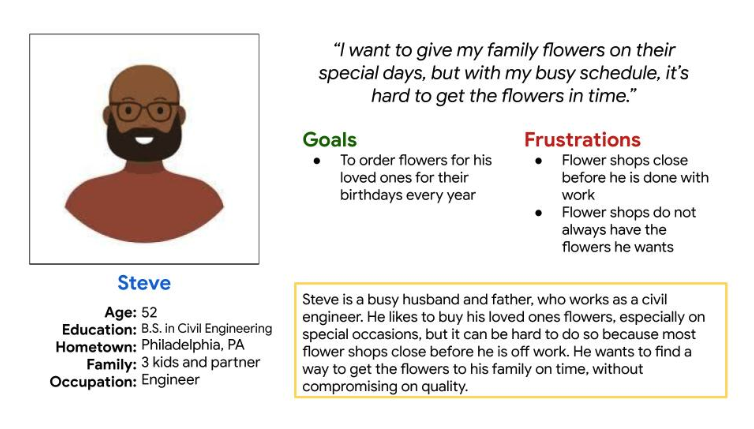
A persona based on interviews and potential users.
-
User Pain Point #1
Layout
Floral boutique websites are often overwhelming in layout with too many options for users to choose from. It is difficult to find what they are looking for.
-
User Pain Point #2
Scheduling
Scheduling flower deliveries can be hard and some websites do not include a calendar view making it harder to select the correct date.
-
User Paint Point #3
Navigation
Some websites do not allow users to move back and forth, as well as do not allow them to review their information throughout the checkout process.
Sitemap of Website
I created a sitemap to help me prioritize what categories and features should be on the website.
Paper Wireframes
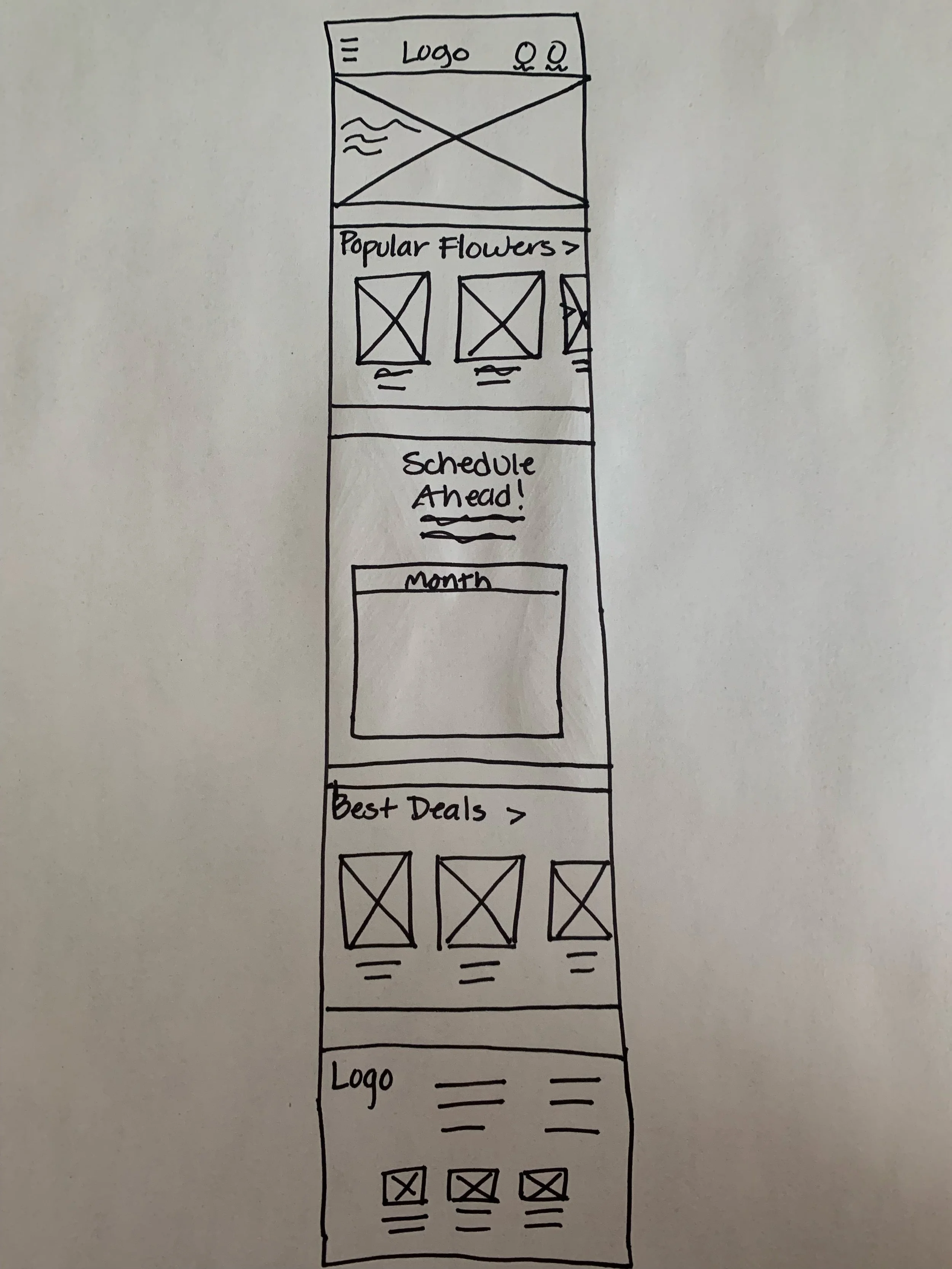
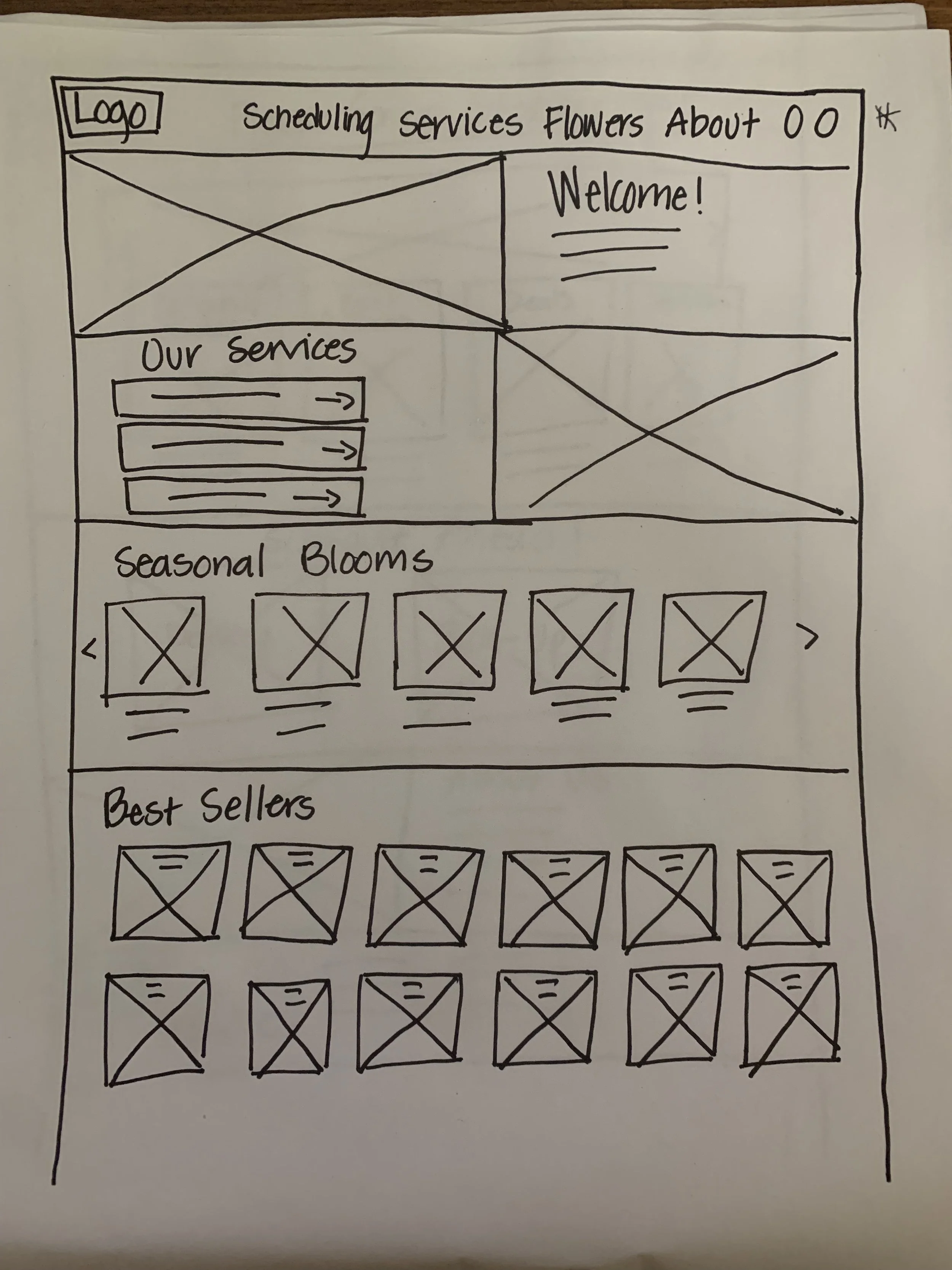
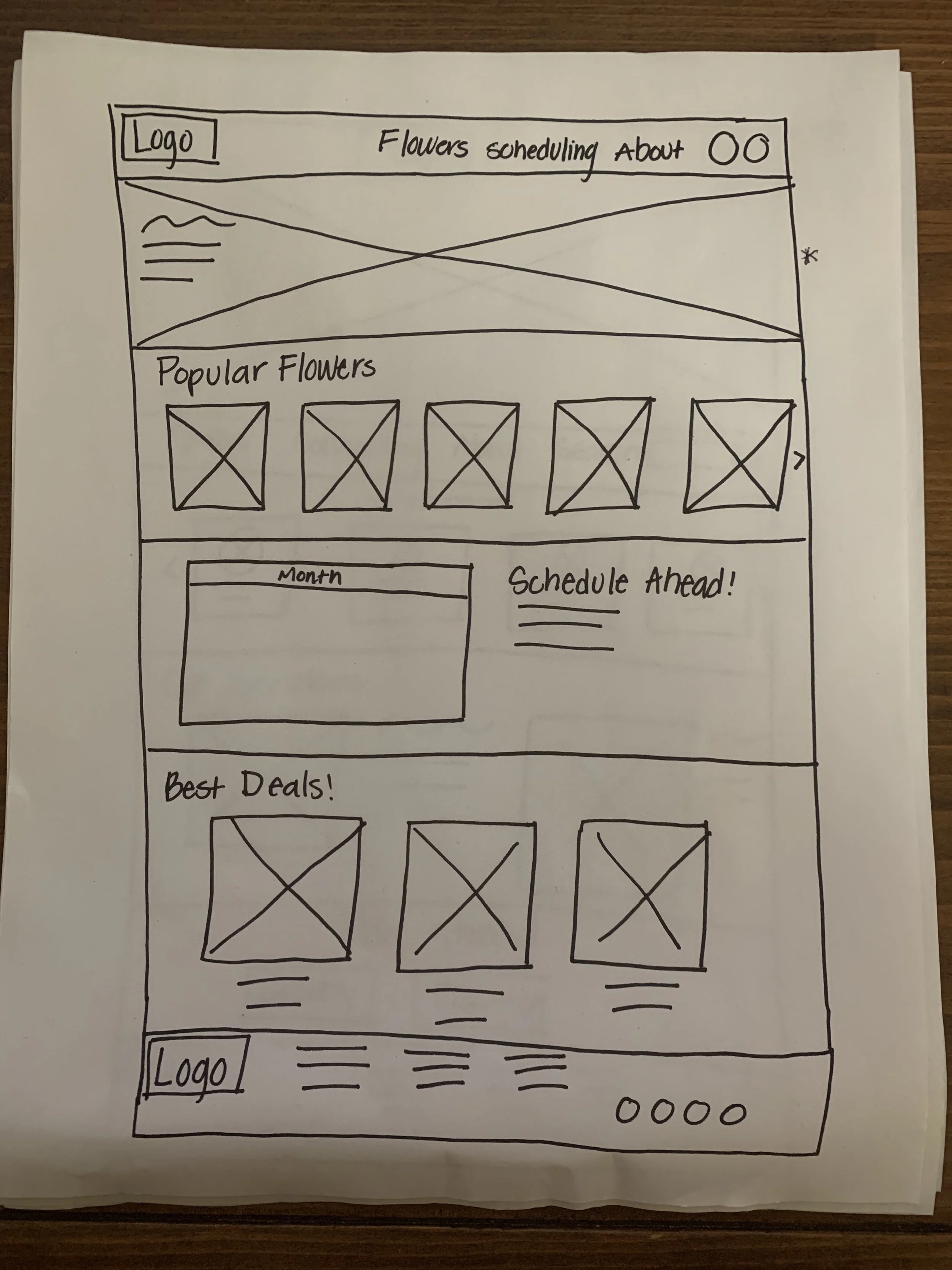
I created paper wireframes for different layout variations for the desktop version of the website first (see top 2 photos of paper sketches). Then, once I chose a layout, I sketched the mobile version.
Digital Wireframes with Screen Size Variations
I created the variations in screen sizes for the homepage of the website to demonstrate responsive design.
Low-Fidelity Prototype
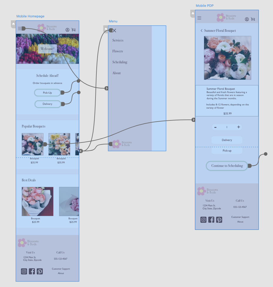
The user flow allows the user to select a product from a category on the homepage. They are then able to add the product to their cart and schedule delivery. Next, they can move through billing, shipping, and payment method. Lastly, they are able to review their information and place the order. A main priority for the user flow was taking the user through the scheduling portion because that was a pain point for users on other websites.
Unmoderated Usability Study
Conduct an unmoderated usability study, in which participants varying in ages 18-65, gender identification, and visual abilities are taken through tasks to determine whether or not the user flow is intuitive, easy to navigate, and includes features that are actually beneficial
Research Questions: Can users select a bouquet to schedule to be delivered? Can users easily move back and forth through the user flow? Is the checkout process difficult for users to complete? Is the website easy for users to use?
Findings
-
Cart
There was no indication that the user had actually added the product to their cart
-
Checkout
There was not a way to alter the amount of items in the cart throughout the checkout process
-
Layout
Some users felt the homepage was a little overwhelming
High-Fidelity Mockups
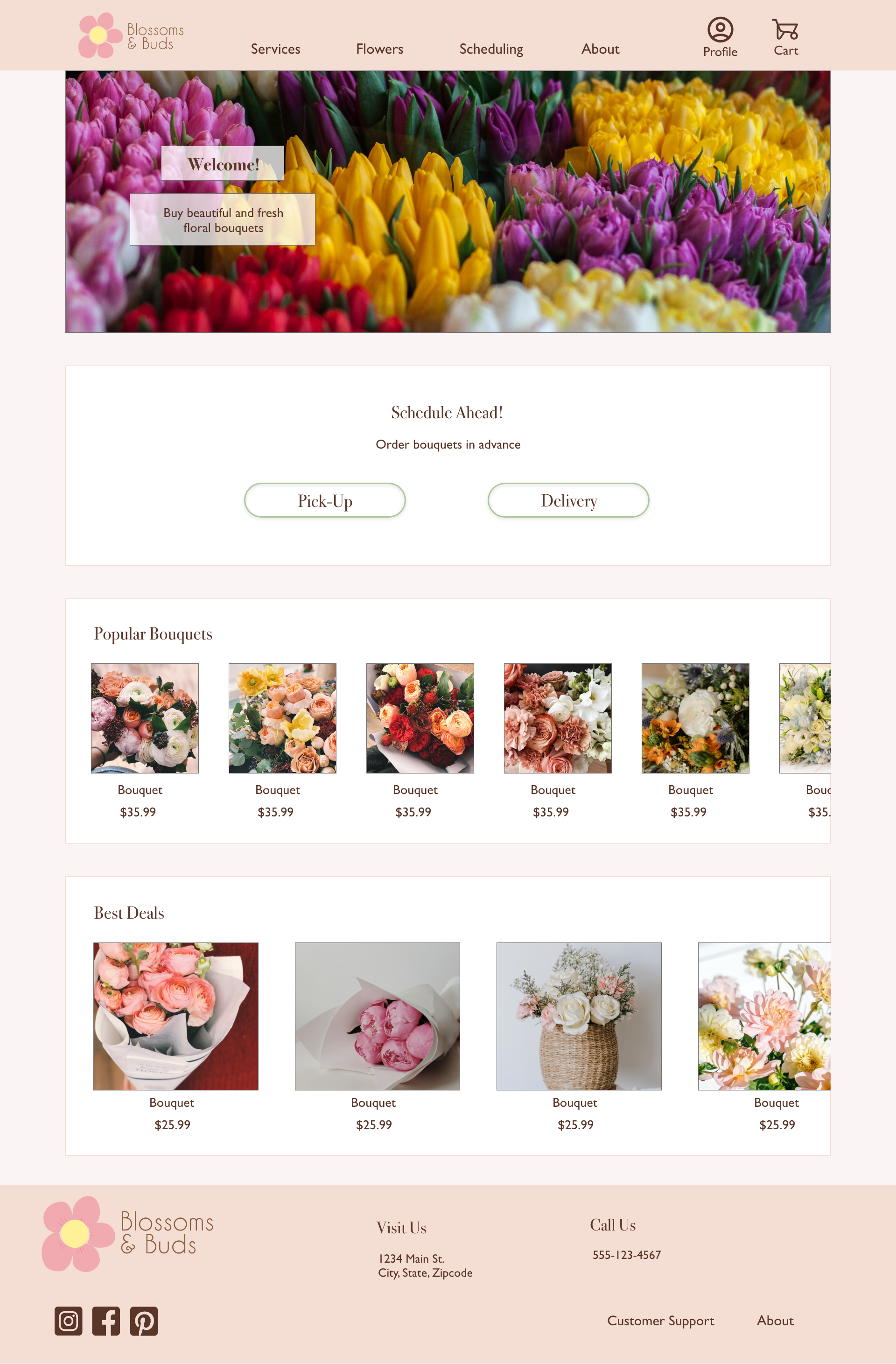
Desktop Version
Mobile Version
Accessibility Considerations
Consideration #1
Utilized colors with high contrast so that information is easier to read.
Consideration #2
Created visual hierarchy with different font sizes to increase navigational ease
Consideration #3
Included text labels with icons so that it is easier for people to understand the meaning of the icons.
What I Learned & Next Steps
What I Learned
I learned that prioritizing accessibility, user pain points, and design principles all together can make designing a much smoother and more beneficial process for users as well as the teams who create the product.
Next Steps
To complete user flows for all potential flows for the website to ensure that the products addresses user needs.
Incorporate more features for accessibility purposes, such as making sure a screen reader can read the information.
Conduct more usability studies based on the new user flows and designs.


